Monday, October 24, 2016

Halloween Frames With 3D Shimmers Lighted Embellishments


Hello friends! Today I am sharing a fun Halloween home decor project over at Paper House Productions.  


For my project I created some scary frames to place on my shelf in my studio with the new 3D Shimmers Lighted Embellishments.  They are so cool! I love that I can press them any time and they light up.

Halloween Frames Supply List
You will need:
3 - black 8 X 8 inch frames (I used shadow box frames that come in a 3 pack at Michael's but they don't have to be shadow box frames)
Adhesive - (I used my ATG gun)
Large Paper Trimmer
Paper House Productions Supplies (listed below)
I began with three (3) black - 8 inch by 8 inch square frames and cut my patterned papers down to 7 1/2 inches by 7 1/2 inches and adhered them on top of the glass.
img_5036
I added my 3D Shimmer Lighted Embellishments about one inch from the top of the frame and made sure they were centered and stuck them down also being sure that the ribbon for each of the Shimmers were tucked underneath. This way if you want to repurpose them for hanging in the future, you still are able to use them.
img_5036-version-2
To complete each frame, I added some 3D stickers on the top middle area of each frame and also added some stickers to the paper area and also added the word stickers from the Scary Sculpted Sticker set to the bottom middle of each frame.
img_5036-version-3
I hope you enjoyed my project and are inspired to use these wonderful 3D Shimmers Lighted Embellishments on your next project.  Be sure and check out all the wonderful products at Paper House Productions for your next home decor project. Happy creating!


Saturday, October 22, 2016

Featured At Scrapbook Expo

Hello friends! Hope you are having a great weekend so far.  I am excited to be featured in the "Weekly Scrapper" feature on the Scrapbook Expo blog today.


I originally created this particular layout for Paper House Productions using the beautiful new Autumn Woods collection and my distress inks to give it more of an artsy background.  Syd is my new puppy who has stolen my heart and has also helped me to get outside and walk.

Thanks for visiting and I hope you stay a while and check out my blog.

Have a great day!


Tuesday, October 18, 2016

Just Nick/Simple Stories Team Up - A Perfect Autumn Day


Hello friends! Today I am excited to share my layout that I created for the Just Nick/Simple Stories Team Up that is happening now until October 22.


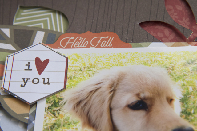
I was given the Hello Fall collection by Simple Stories and I thought it would be perfect to scrap this photo of my puppy Syd and his first autumn with us.  

 I wanted to create a lot of depth and dimension to this Fall layout, so I arrange the leaves from the Leaves 3 cut file in Silhouette Studio and cut it out with my Silhouette Cameo and then I added some thin strips of foam adhesive to the backside of the brown wood grain paper and then cut some different colors of papers from the collection and stuck them on to the foam adhesive strips.  I just love the depth it gives the layout.


After matting the photo on the plaid paper,  I fussy cut a leaf, the "I heart you" hexagon and the Hello Fall sticker and created a cluster on the top right hand corner of the photo.  I fussy cut the title from a project life card in the collection and also popped it up with foam strips and then cut out the "nuts about you" and also made a little banner out of the graph paper and then I added some acorn stickers to it and popped up the "nuts about you" phrase.  Finally I added a strip of the plaid paper to the bottom of the layout and added my pup's name and date with a black fine line pen.


Well there you have it. I hope you enjoyed your visit and I always welcome comments and questions  from my blog followers. 

Be sure and check out the Just Nick shop for all your cut file needs.  There are four new cut files every week and one free cut file a month.

Friday, October 14, 2016

My Creative Scrapbook October Tutorial

Hello friends! Today I wanted to share a step by step tutorial with the October Main Kit at My Creative Scrapbook.

 I created this layout of my dad, who celebrated his 80th birthday, and wanted to create a fun layout.  My dad really is a lot of fun so I thought that the October Main Kit would be perfect.


October Main Kit

You will need:

  • scissors
  • liquid adhesive (I used Tombow Aqua Mono Liquid Glue, but Glossy Accents will also do)
  • taperunner (I use my ATG Gun)
  • dimensional foam squares or pop dots
  • ruler
  • October Main Kit (My Creative Scrapbook)

Let's get started:

Begin with a twelve inch by twelve inch (12 X 12) sheet of white card stock.

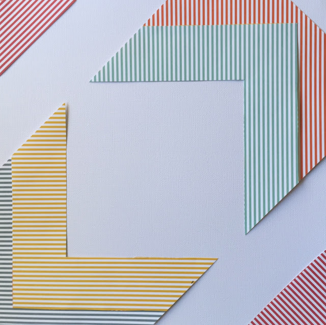
With a ruler,  cut a 4 inch by 12 inch (4X12) strip of the colored chevron striped sheet and cut the different colored strips apart as shown below.


Adhere the striped colored strips to the white card stock as shown below.


Add the remaining colored strips and align the strips making sure the edges of the strips fit diagonally as shown.  Adhere.


Cut a six inch by six inch (6X6) square piece of the van patterned paper and adhere it to the inside middle square of the white card stock background.  Print a 4 inch by 4 inch (4X4) square photo and adhere with dimensional foam square to the middle of the van patterned paper.  With scissors, cut out the "you are the best" square and the "big deal" square and adhere them to the top right hand corner and bottom left hand corner of the layout.


Cut out the "love" square and the "wild about you" square of patterned paper and adhere below the other squares as shown below.


Add the word "love" on the top left corner placing it on a diagonal slant and the word "you" to the bottom right corner as shown on a diagonal slant. Adhere.


Place the van die cut on the layout as shown below and pop it up with some dimensional foam squares.


Place the eye glasses die cut on the layout as shown and adhere.


Add the two tags and overlap the smaller tag slightly over the large tag and adhere with some dimensional foam squares.


Add the colored hearts acetate strip underneath the bottom of the photo and use liquid adhesive to adhere. 


With liquid adhesive, glue the black sequins to the left side and right side of the word "love"


Also, using the liquid adhesive, glue the black sequins to the left side and right side of the word "you"


Add the pink heart diecut to the layout as shown below.


Add the cut camera die cut below the "love" square and adhere.


To give the glasses more interest and for more of a whimsical touch, I added a large green sequin and topped it with a black sequin on top to create "eyes." Again, adhere with the liquid adhesive.


Finally add the journaling with a black acid free pen below the word "you".


The layout is now completed!

I hope you enjoyed my tutorial.  Thanks for stopping by and have a creative day!


Thursday, October 13, 2016

Remember You Are My Sunshine

Hello friends! Today I am sharing another layout on the blog at A Flair For Buttons.


I used flair from the Relax Flair set and the Just Hearts 1 set.  Sometimes I like the flair buttons to color coordinate and these flair buttons do just that.  The papers and ephemera on this layout are from the Here Comes The Sun Collection by Pretty Little Studio.


Flair Used On Layout:


Wednesday, October 12, 2016

Autumn Is In The Air Layout

Hello friends! Today I have another Autumn themed layout on the Paper House Productions blog.  I simply love the Autumn Woods Collection.  The colors are so gorgeous!  I thought it would be perfect to scrap a layout of a recent hike to the mountains with my puppy.


Autumn Is In The Air Layout Supply List
Here are some more detailed photos of my layout:


I fussy cut the title "Autumn Is In The Air" and popped it up with some foam squares.


To direct the eye down towards the photo, I cut out a paper triangle to use as a "photo corner" and added a floral cardstock sticker and fussy cut the heart and adhered it to the photo corner.  


There are some lovely paper strips in the Autumn Woods collection so I added three paper strips to the bottom of the layout and fussy cut the words "the colors of fall, changing colors, and autumn is in the air".

This was a simple layout to create and the papers simply make it.  Thanks for stopping by and be sure to check out the Paper House Productions store for hundred of beautiful papers, embellishments, stickers, etc.  Have a lovely day!


Just Nick/Pretty Little Studio Team Up


Hello friends! Today I'm sharing a layout on the Just Nick Digital Cut Files blog using two Just Nick cut files (Basketweave Background and Doodle Flowers 2) and some gorgeous papers and other products from the Here Comes The Sun Collection by Pretty Little Studio.  If you haven't checked out Pretty Little Studio's products, please do! I could buy every single line.  Of course I had to discipline myself to choose only one collection.


To create my layout, I cut out the Doodle Flowers 2 cut files in different sizes on some adhesive backed card stock with my Silhouette Cameo and with my water color paint set painted the flowers in blue, pink, green, black and yellow keeping it placed on the mat as it makes it easier .


After the flowers were painted, I let them dry completely then peeled them off of the sheet and backed them with patterned papers from the Here Comes The Sun Collection by Pretty Little Studio.


For the background, I cut out a 12 X 12 inch sheet of white card stock using the Basketweave Background and my Silhouette Cameo.  When it was cut out, I placed it over another sheet of 12 X12 inch white card stock and then stitched around the outside edge with my sewing machine.  


Next, I added the photo and then decided on the placement of the flowers,  I tried to alternate with large and small flowers in a diagonal design from the top left edge of the page to the bottom right edge of the page.


Once the flowers were all adhered to the background paper, I added flair buttons to the center of some of the flowers as well as some star embellishments around the page and also some ephemera.


I added some little black alpha stickers to complete the title of the page.


Cut files that I used on my layout:


I hope you enjoyed your visit and my tutorial on how I created my layout.  Have a creative day!