Thursday, April 28, 2016

Father Layout

Hello friends! Today I am sharing a layout of my husband and son on the A Flair For Buttons blog.
I love this photo of my husband and son when my son was a newborn.


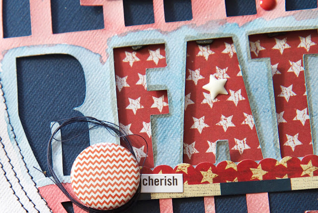
For this layout I used 3 flair buttons from 3 different sets of flair.  


I created the cut file and cut it on my Silhouette Cameo and backed the negative space alphas with a navy piece of card stock and also added the red and white star paper behind some of the words that said "father".  To give it more dimension and shadow, I added small adhesive squares to the backside of the cut out negative alphas.


I used the Faded Denim and Aged Mahogany Distress Inks by Ranger and my water brush to create a watercolor effect on the white card stock.


to make the flair buttons stand out more, I added some navy sewing thread around the flair.  I like the texture it gives the layout.


For the title "father" I used a Ranger Distress Pen in Pumice Stone to outline the letters and make them stand out more.  


This layout was inspired by Ashley Horton's Texture Techniques class.

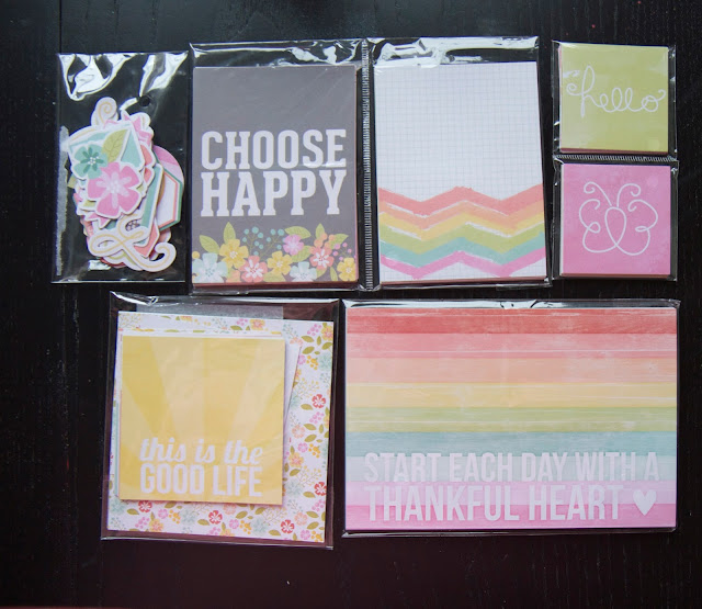
These are the sets of flair that I used on my layout:


Be sure and check out all the flair in the A Flair For Buttons shop.  There are so many to choose from.

Thanks for stopping by and I hope you enjoyed your visit.  Happy creating!


Friday, April 22, 2016

Play Ball Layout

Hello followers! Today I am sharing a sports themed layout using the fabulous Baseball Collection of patterned papers and stickers over at Paper House Productions.  This layout is of my youngest son when he played his first year of baseball a few years back.  Time sure does fly as he is now 16.
Paper House baseball1
Play Ball Supply List
IMG_2433
I used my antique sewing machine and stitched along the outside edge of the layout, the navy paper triangle, the circles and also the middle of the baseball stitched paper. I love the extra texture and homespun feel that stitching gives my layouts. This is totally optional.
IMG_2436
I added lots of stickers to the layout and gave some of the stickers added dimension by using some foam adhesive squares on the heart sticker, the title "Play Ball" sticker and some of the baseball stickers.  I also added my son's name with the mini alpha stickers on top of the heart sticker and also on bottom right corner on top of the ticket sticker. 
IMG_2438
IMG_2441
Adding the star stickers directs the eye down the page to the title and photos.  
IMG_2437
The banner sticker strip and the baseball sticker strip are tucked slightly under the 4X6 photo and the 2X3 photo so it finishes it nicely.   I also added the tiny circle heart sticker to the left triangle on the 4X6 photo.
To complete the layout,  I added a little "home plate" sticker beside the small photo and wrote the year with a black pen.
I hope you are inspired to create a sports themed page using the Baseball Collection. Be sure to check out all the beautiful collections at Paper House Productions.  Have a creative day!

Tuesday, April 19, 2016

Little Monster Layout And A Freebie!


Happy Tuesday! Sometimes I like to create layouts with a bit of humor because life is way too serious, don't you think?  

This little girl is full of beans and I love her spunkiness so when I saw these photos, I knew I had to use the Happy Little Monster Cut Files and create a title with the Striped Alphabet from Just Nick Digital Cut Files.


I used my digital diecutting machine to cut out the monster shapes on some bright papers from the Bo Bunny Lil Monster Collection.  As soon as I saw the title Happy Little Monster, I knew I had these papers in my stash that were screaming to be used.  


As you have probably noticed, if you read my blog regularly, I like to embellish my layouts with flair buttons just for good measure.


Do you know of a little monster that you can create a layout on?  Thanks for stopping by and be sure to check out these cut files and hundreds more in the Just Nick Digital Cut Files store.  


If you have read this far, that is good because there is a freebie cut file that is available to download until midnight April 30, 2016.  Be sure and use the code RAINFREE at checkout.  Isn't it great? 


Happy creating!

Saturday, April 16, 2016

Wood Veneers Layout

Hello friends! I hope you are having a fun Saturday doing something you love.

Today I was in need of some serious inspiration as I feel I have gotten myself into a creative rut so I decided to check out a class at Big Picture Classes.  Ashley Horton is teaching a new scrapbooking class called Texture Techniques.

I have always loved Ashley's work and she is one talented girl. When she first started up The Cut Shoppe, I was on her first design team and loved it.  She always has some great ideas..  I would like to hang out in her creative head for a day. LOL.

I have so many wood veneers in my stash and it felt so good to use up a few of them to create this layout of my niece.  She is a barrel racer and cowgirl and the other day I did some scrapbook shopping and found this wonderful scrapbook paper by Authentique.  It's from the Homestead
Collection.  I thought it was perfect for a country/farm theme.


Recently I went to a Crop and Create event and bought some more Gelatos so I colored some of the wood veneers in some colors from the Bright Gelatos pack.  


 I love flair buttons and I have had these flair buttons in my stash FOREVER.  They were from The Paper Bakery.  


This was so much fun to create and it felt good to create for me.  I have been so busy with design team assignments lately which I love, but I also like to try something new too. 

Thanks for stopping by today and enjoy your weekend!


Friday, April 15, 2016

Using Circle Punches On A Layout

Hello friends! About a week or so ago it was the April kit reveal at My Creative Scrapbook and I had promised a tutorial on how I created one of my layouts with the April Creative Kit so here it is.  Get ready to put your circle and scalloped paper punches to work.


Kit Supplies

Snap Cards
Yellow Polka Dot Patterned Paper (For paper strips and matting the photos)
Butterfly Paper (handcut a green, yellow, aqua and pink butterflies)
Stickers (Spring Banner, Bloom Where You Are Planted, It's A Beautiful Day Today! and Butterfly Circles)

Additional Supplies

12X12 sheet of white textured cardstock
Adhesive - tape runner and dimensional foam dots or squares
Craft Paint Or Mist (I used Heidi Swapp Colorshine in Mustard Yellow)
Paper Trimmer
Pencil
Ruler
Scissors
Circle Paper Punches (in a variety of sizes if possible)
Scalloped Circle Paper Punches (in a variety of sizes if possible)
Collage Maker For Photos (I used Turbo Collage on my iphone, but any collage maker will do)

Instructions

Cut the yellow polka dot paper in strips with a paper trimmer and adhere to top and bottom edge of the 12X12 sheet of white textured cardstock.

Add paint or mist splatters to the top left, top right and bottom left of white cardstock as shown. Be sure paint or mist is dry before moving to the next step.


With the Snap Cards, which are included in the kit, select several colors and sizes of snap cards.


Punch the selected Snap Cards with circle paper punches and scalloped circle punches.


Using the pencil and ruler, draw pencil lines across the 12X12 sheet of white cardstock as shown.


Hand cut the punched paper circles in half with scissors.


Arrange the paper circles, that are cut in half,  flush along the pencil lines being sure to overlap and alternate colors.


When you are satisfied with the placement, adhere the paper circles down with adhesive and if you would like, add some dimensional foam dots or squares to the backside of some of the circles to give more dimension.

Create photo collage and print.

Mat photo collage with yellow polka dot paper and adhere to the page using dimensional foam dots or squares.  Make sure that the matted photo collage is beside the punched paper circles as shown.

Fussy cut the four butterflies and adhere to the page with foam dots or squares.

Add circle butterfly stickers to the page with foam dots or squares

Add Spring Sticker Banner to the page as shown and also the other stickers as shown.

Your layout is complete.


I hope you enjoyed this tutorial and give it a try. Happy creating!

Thursday, April 14, 2016

Now Playing Layout

Today I am on the A Flair For Buttons blog sharing a layout of some of the movies my hubby and I have gone to see at the local theater for some of our date nights.


I used three flair buttons from the At The Movies flair set for this layout.

For my papers, I used some older Bella Blvd. patterned papers and stickers from the Scattered Sprinkles Collection and also machine stitched the paper strips in place instead of adding adhesive to the back of the strips to keep the strips in place.  The layout was inspired by a sketch from Laura Whitaker.


I arranged the flair buttons in clusters with some stars that I punched out with a star paper punch.  


I arranged my 2X2 photos in a group.


I also added some splatters of black ink and some red thread for more texture and interest.


Here are the lovely flair buttons.  Aren't they perfect?


Thanks for stopping by and be sure to check out the amazing flair buttons in the A Flair For Buttons shop.  There are always new flair being added.


Wednesday, April 13, 2016

Hello Lovely Layout

Hello lovely friends and followers! Today I wanted to share my fourth and final layout with the April Creative Kit at My Creative Scrapbook.  I am really into circles these days so I used my circle paper punches in various sizes as well as my heart paper punch.


I cut 9 large circles and stacked them with 9 slightly smaller circles.  I added some journaling to the bottom right. 


and added some paper punched hearts that I popped up with foam squares.


I added the colorful letter stickers over a paper sticker strip .


The doily and bow give the layout a more feminine look.


Finally I added the stickers for the word "Hello"


I hope you are inspired to take out your paper punches more and create with them.  Have a great day!