Saturday, September 26, 2015

Fall Layout

Happy Saturday! Today I am on the A Flair For Buttons blog with a Fall layout.

 I tend to be a seasonal scrapper and the minute that my son went back to school I took out the Fall scrappy goodies.


This layout was created using some watercolors, patterned paper, some digital cut files from the Silhouette Online Store, stickers, twine, mist splatters and of course some flair buttons from A Flair For Buttons.

For this layout,  I used the Fall 3 Flair and the Fox And Owl Flair.  I placed one flair button from the Fox And Owl Flair Set to the left of the photo to lead the eyes to the photo.


 and I placed another flair button from the Fall 3 Flair Set on the right hand corner of the layout in a cluster.


Here are some more closeups


I backed the white card stock background with several different colors of patterned paper.  I used the So Rad Collection by Simple Stories for the papers and an older collection called Sweater Weather from Simple Stories for the title stickers and some stickers from Doodlebug Designs Friendly Forest Collection. 

You can find lots of Fall, Christmas and Thanksgiving flair in the shop right now and some are new! Go here to shop. 

 Thanks for stopping by! Have a great day!

Flair Used On This Layout


Friday, September 25, 2015

Scrapping Our Stash September 2015 Blog Hop


Hello friends! It's Lee-Anne here and I am excited that you are here.  A group of us ladies get together once a month to bring you a blog hop using our stash. 

 Every scrapbooker has a stash of papers and embellishments and we wanted to inspire you to get out your stash and use it up.  Be sure and visit all the ladies on the blog hop list as I am certain that you will be inspired.


For my project, I created a layout of Fall in the country in my area.  I had a 6X6 paper pad that I have had for at least 3 years called Harvest Lane by Simple Stories.  

I began by designing the word "Fall" on my Silhouette Cameo.  I then cut it out on a 12X12 piece of white card stock with my Cameo and set the letters aside for another project.  I wanted to use the negative space for each letter. 

To make the letters pop more, I took out my distress inks and my water brush and painted each letter a coordinating color that would go with the patterned papers and let it dry.

Now it' time to cut your paper strips in 1/2 inch strips and arrange them on the backside of your white card stock.  I make sure they are laying next to each other and for mine I placed them on a diagonal.  I then used some tape and taped them down.

After all the letters were backed with patterned paper strips, I added my photos, the alpha sticker title in the center and some coordinating embellishments such as a crochet heart, leaf stickers, enamel dots and a flair button.


Here are some more closeups.


This layout was so much fun to do and it is a great way to use up your paper scraps.  I hope you are inspired to give this a try.  Next up on the blog hop is Alison.  I'm sure she has something awesome to share with you.  Happy hopping!


Wednesday, September 23, 2015

Happy Lovely Beautiful

Hello friends! It's Wednesday and I have another layout to share with you today.

This past June, my sister-in-law got married again.  To explain things further, my brother passed away 9 years ago at the age of 38 leaving behind his wife Pam and his two children Laine that was 4 years old and Dylan that was 2 years old.  It was a very hard time for Pam and my family but life goes on and this past summer Pam got married again to a wonderful guy that we have welcomed into our family.  We are so happy that Pam found love and happiness again and we know that my brother would have approved of her choice in a new mate.

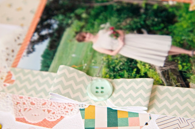
I thought I would document this special time for Pam so I created a layout of her on her wedding day.


For this layout I used a Fiskars Hexagon Paper Punch, a 6X6 paper pad of the new Crate Paper's Wonder Collection, the We R Memory Keepers Envelope Punch Board to make the paper bows, some mist splatters from Heidi Swapp Colorshine Mists in Seafoam, Blush and Black Velvet, a 12X12 piece of white card stock, a doily, some old Basic Grey chipboard alphas and some old Fancy Pants buttons and sequins in my stash.


 I love using 6X6 paper pads for layouts.  The prints are a little smaller than the 12X12 papers and I love to use my paper punches on these.  Patterned paper has to be my favorite scrapbooking item.


The paper bows are a great way to embellish the layout give it a feminine touch.  They are so fun and easy to make using a We R Memory Keepers Envelope Punch Board.  


Thanks for stopping by and hope you are having a good week.

Tuesday, September 22, 2015

A Bright Sunshiny Day Layout

Hello friends! Today I am excited to share a layout I created for Just Nick Digital Cut Files of my mom using some Tim Holtz Distress inks, a script rubber stamp and the Dandelion Background Digital Cut File.


I cut the Dandelion Background  with my Silhouette Cameo on some white card stock and then took some distress inks and my water brush and painted the petals in several different colors.  When they were dry, I cut them apart to make several flowers.  I used a large background script rubber stamp and used the same colors of distress inks and stamped them in the same shade as the watercolored flowers.


I hope you are inspired to use your watercolors, inks and stamps on your cut files.  Thanks for stopping by!


Sunday, September 20, 2015

Two Layouts To Share

Happy Sunday! Today I have two layouts to share with you.  I completed a class of Paige Evans over at Big Picture Scrapbooking called Paige's Pages 04.  Let me tell you I love Paige's style and I can't tell you how much she inspires me and it helps me take my creativity to a whole new level.  Sometimes I love to be challenged and Paige helps me think outside the box.

Both these layouts were created with the new So Rad Collection of patterned papers by Simple Stories.  I have made four layouts with this collection and I can't get enough of it.  The colors are fabulous.  The title "Rad" was created from a cut file at Just Nick Digital Cut Files. 

The first layout was using paper strips.  I love this photo of my youngest son.


and this layout was using confetti.  I designed the large "Fall Title" on my Silhouette Cameo and for the  "Changing Leaves" title I purchased from Kerri Bradford Studios.  I love Fall and took this photo last year of a beautiful acreage near my home.


I won't go into detail about the creative process of these layouts because it's Paige Evan's class and I urge you to take it if you want to get creative.

Thanks for stopping by and have a great day!

Saturday, September 19, 2015

Brothers Forever Layout

Happy Saturday!  Last night I was looking on Pinterest and I was totally inspired by a layout I saw of the amazingly talented and sweet Paige Evans.  I thought I would give it a try and this layout proves  that a person doesn't need to throw out those tiny strips of paper they have laying around.


I must admit this is a labor intensive layout but I am so happy how it turned out.  The photo is of my two sons at a local amusement park two summers ago.  My oldest son is 30 and my youngest son is 15 so my youngest looks up to his older brother as an example and a mentor.  I love it.  


I used the new So Rad Collection by Simple Stories and this is the fourth layout with this collection and I had lots of scraps of paper so this type of layout is perfect to use up those scraps.


Of course my favorite embellishment is flair buttons so I added one from A Flair For Buttons.


I used my Silhouette Cameo and a cut file from the Silhouette Online Store to cut out the large stars in the white card stock and the smaller orange stars.  I used my sewing machine to stitch around the larger stars on the white card stock.


Jillibean Soup has some wonderful wood buttons so I added those to the center of the orange stars.


Finally I added some Jillibean Soup little star enamel embellishments and some Heidi Swapp Colorshine "Tea" mist splatters.  I felt the orange stars needed a little more pop so I got out my black pen and added some faux stitching.

This took up my evening last night but I always am happy to share my layouts with my sons and show them how special they are to me.

Thanks for looking and I hope you have an awesome day!

Friday, September 18, 2015

Some More Layouts Published!

Happy Friday! It's been quite the stressful week so I am happy it's the weekend.

Today I am excited to share that I have three layouts published in three magazines this month.  I am feeling very blessed.

Scrapbooking for me began as my therapy for healing from my past and I never felt that it would end up being so rewarding for me!  I suppose other people see things that I don't see and encouraged me to take my hobby further.  Four years ago it all began with Anam Stubbington asking me if I would be interested in joining the Twisted Sketches Design Team.  I have always admired Anam's talent and was totally blown away with her asking me.

It began from there and I can't believe the journey that my passion has taken me on.  Whenever I sit down in my scrap room, I feel so calm and when I am in the creative zone it is like meditation.

Thank you for sharing in this journey with me.

Today I am excited to share that the Fall 2015 Scrapbook And Cards Today Magazine is available for download free!  It is also a printed publication that can purchased by a subscription or in many scrapbooking stores.


I have this layout of my youngest son on his first day of high school on Page 70.


Here is the link to download this issue:


Also, the September Bella Buzz is available for download.  This is a e-zine that Bella Blvd. publishes several times a year that is free.  There is lots of inspiration on using your Bella Blvd. products.


I have a layout of my daughter and son in law on Page 5 


Here is the link to download this issue:


The September 2015 issue of CREATE Magazine by Scrapbook Generation is also available for download for free.  This is chockfull of awesome sketches and it's huge. 


I have a layout of my youngest son on Page 195 of this issue:


Here is a link to download this issue:


Hmmm….I have noticed that all these are created with Bella Blvd. Yes I really love Bella Blvd.  I love that all their collections can be mixed together.

Thanks for sharing your day with me.  I hope you are inspired to do something you love and have an amazing weekend!  Thanks for stopping by!


Thursday, September 17, 2015

Create Magazine September 2015 Issue!

Hello friends! Happy Thursday! I just wanted to let you know that Scrapbook Generation Magazine is a digital magazine that publishes every two months and there is a new issue for September.

I feel honored to be included in this awesome magazine.  I have a layout on page 195 of the September 2015 issue.

September 2015 Scrapbook Generation's Create Magazine Cover

Here is my layout.  I used the Bella Blvd. Max Collection for the papers and stickers and some flair buttons from A Flair For Buttons.  This layout was originally posted for my design team assignment at A Flair For Buttons.


For a link to the September issue you can go here.

There are many more issues available for viewing and downloading at 


Thanks for stopping by and I hope you enjoy your day!

Tuesday, September 15, 2015

Celebrate 7 Years Layout

Hello friends! Today I wanted to share a layout of these two lovebirds. My son and daughter in law recently celebrated their 7th wedding anniversary.  When I was visiting them last month, I snapped this photo and knew I had the perfect paper for a layout.


 I had recently guest designed for My Creative Scrapbook using the September Main Kit and I had some leftover papers. The patterned papers, stickers, flair button and die cuts are from the new My Mind's Eye My Story Collection.  I loved the hearts so I cut them out with scissors and stitched them to my layout.


I added some ephemera and fussy cut the butterflies and spritzed with some Heidi Swapp Colorshine in Gold, Black and Blush on the white card stock background.


I usually trim the threads after I sew, but for this layout I wanted to give it a whimsical look so I kept the threads long.


Thanks for stopping by and hope you have a great day!

Monday, September 14, 2015

Summertime Layout

Hello friends! Glad that you stopped by! Today I am sharing a layout over at Just Nick Digital Cut Files of my gorgeous friend and daughter.  They made their own floral wreaths that they are wearing on a nice summer's day.


I used two different sets of cut files on this layout, the Bubble Frames and the Graphic Frames.  I shrunk the Bubble Frames Cut Files down to 2X2 inch squares, inked them up with some distress inks and embellished them with stickers and flair buttons.  I cut one of the frames from the Graphic Frames Cut File and added a photo.

My assignment was to create a layout inspired by Pinterest.


Frames aren't just for photos they can be used in different ways. You can find these and many more digital cut files in the Just Nick shop here.

Thanks for looking and have a great day!

Cut Files Used On My Layout

Bubble Frames

Graphic Frames